Cloudline
Mobile Weather Application
About the project
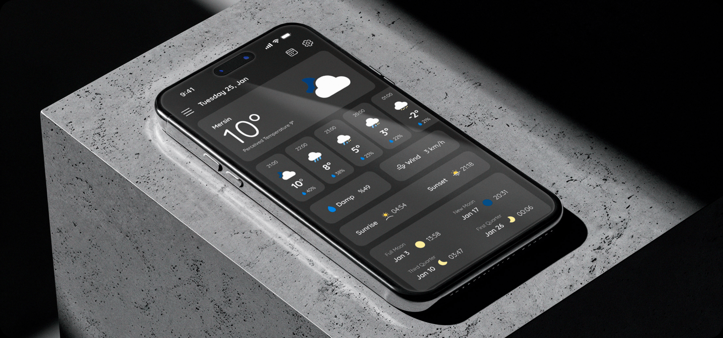
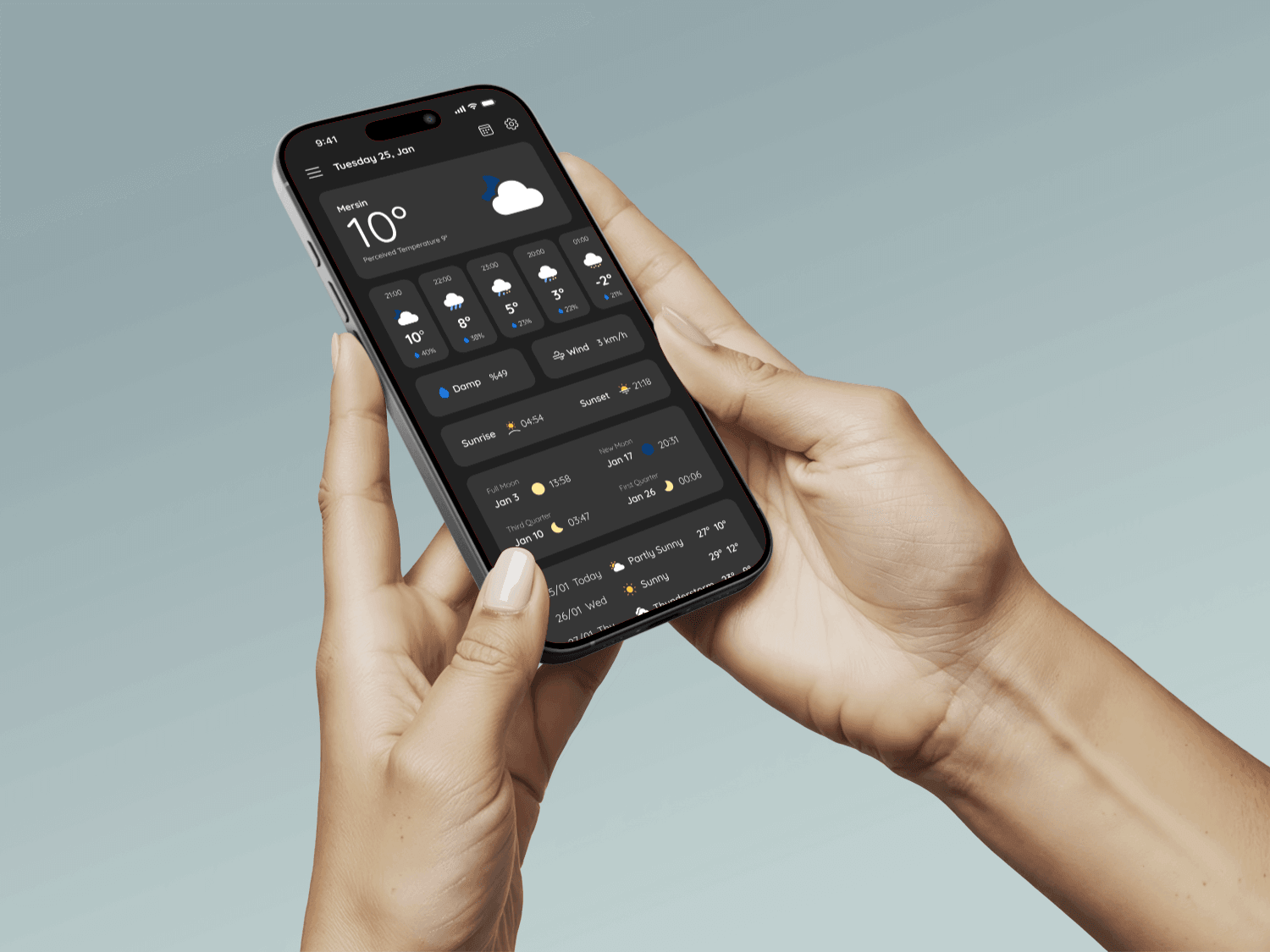
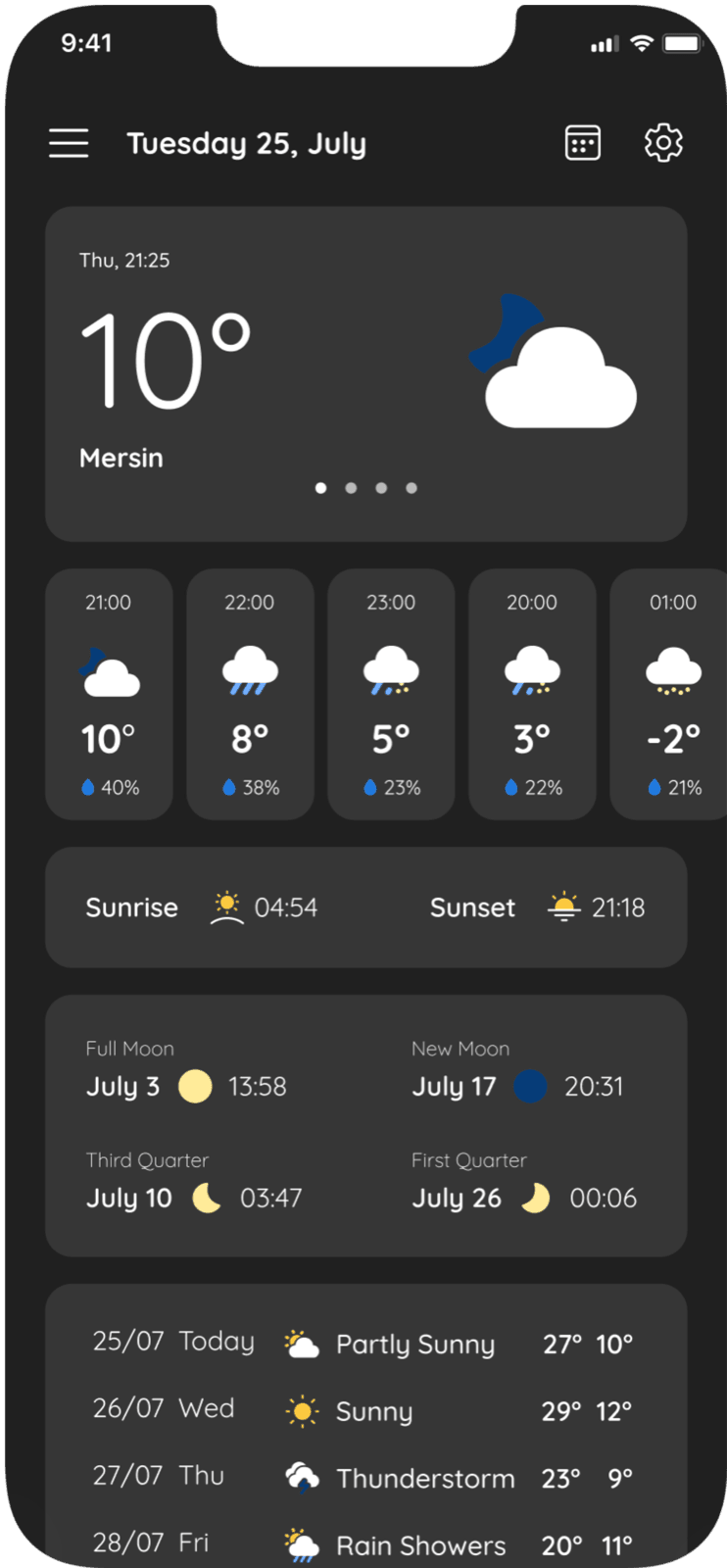
Cloudline is a mobile weather app I designed so people can follow the weather anywhere in the world quickly, clearly and reliably. It brings temperature, feels-like, chance of rain, humidity, wind and conditions into a clean, readable interface. The aim was to avoid information overload and give fast access to the data people actually need to plan their day.
Mission
To simplify dense weather data into a clear, easy-on-the-eyes mobile experience where people find what they need fast.
What I did
I handled Cloudline’s UI/UX end to end: information hierarchy, navigation and the core screens. I focused on making temperature, rain, humidity, wind and other data easy to read, and worked on hierarchy, components and the visual language so the app feels simple, consistent and quick to use.
- Scope
- UI/UX DesignMobile App DesignVisual Design
- My role
- UI/UX DesignVisual Direction
- Tools
- FigmaPhotoshop
What it offers
Live snapshot
See every condition at a glance: temperature, feels-like, wind and chance of rain.
Plan ahead
Plan with confidence for any location with hourly changes, alerts and travel-ready forecasts.
Design process
January 8–25, 2024, about 3 weeks.
Research
DiscoveryStudying weather apps and user needs
Screen flows
StructureHome, location and settings flows
UI and design system
DesignColours, icons and components
Presentation
DeliveryMockups and Behance case
App screens
Home
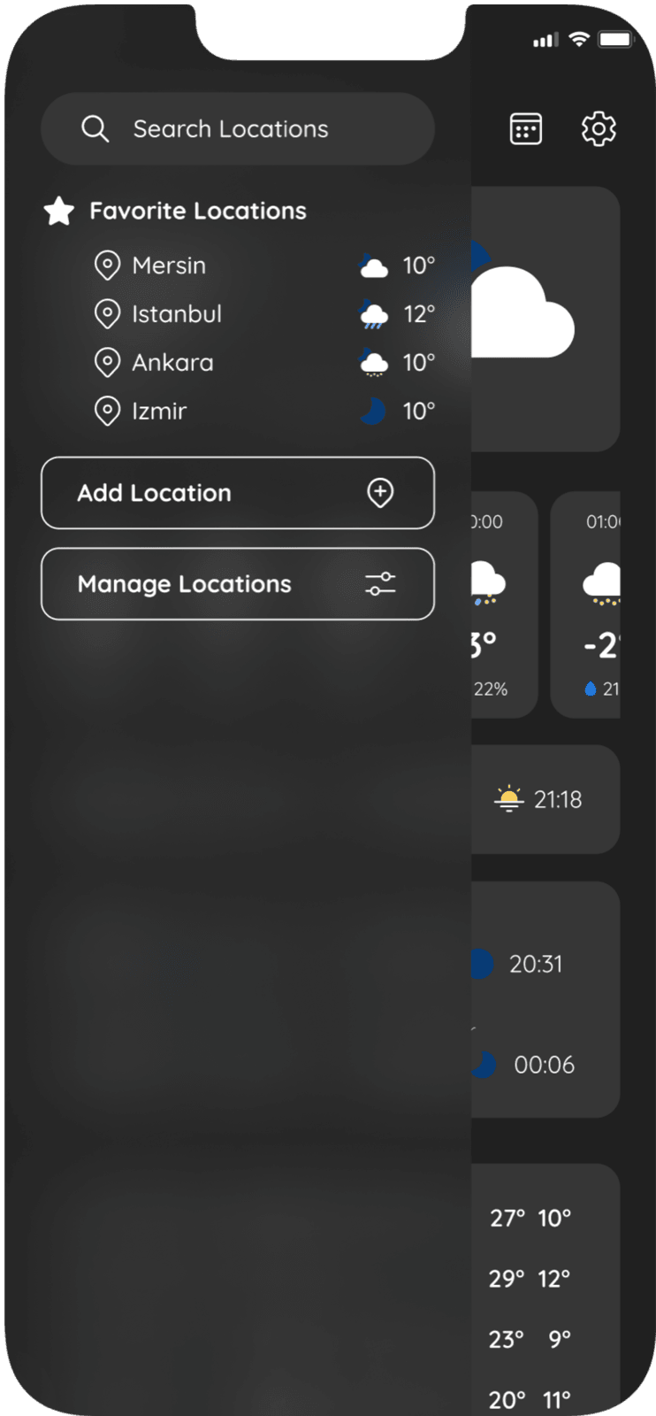
Menu and favourites
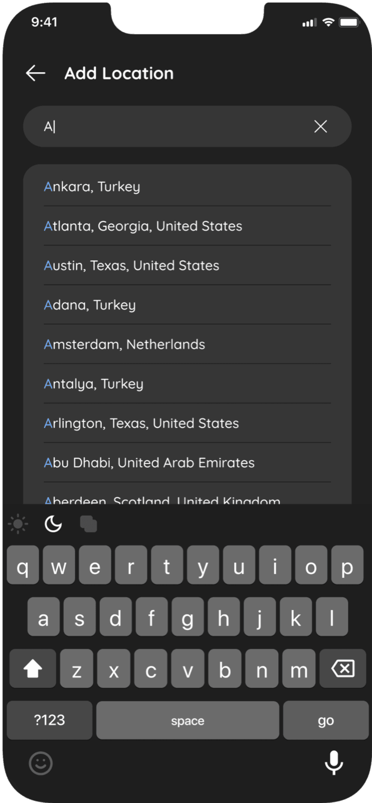
Add location
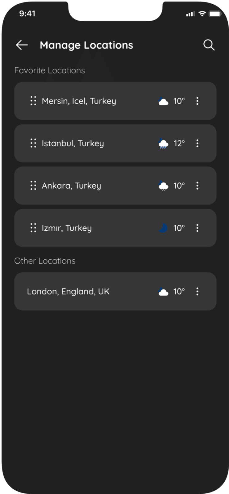
Manage locations
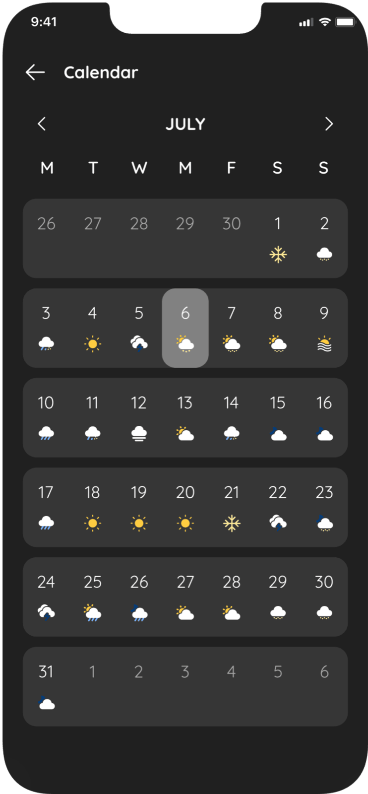
Calendar
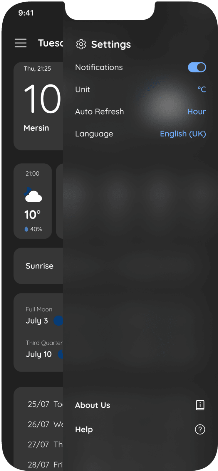
Settings
Logo and visual identity
Cloudline’s identity is built on a simple cloud shape that speaks directly to weather. Minimal lines and a black-and-white palette give the brand a modern, trustworthy character that matches the app’s interface.


- Home screen
60 pt - Search
40 pt - Notification
20 pt
Colours
- Dark Bg#202020
- Cards Bg#363636
- Morning#73B1FF
- Evening#207AE1
- Night#063C78
- Sun#FFCC41
- Snow#FFEB99
Typeface
Quicksand
A display sans-serif with rounded terminals, started by Andrew Paglinawan in 2008 on geometric shapes. Made for display use, it stays legible at small sizes too.
- Aa Bb Cc 0123400
- Aa Bb Cc 0123500
- Aa Bb Cc 0123700
The full presentation is on Behance
See every screen and detail of the project in the Behance presentation.
View on Behance