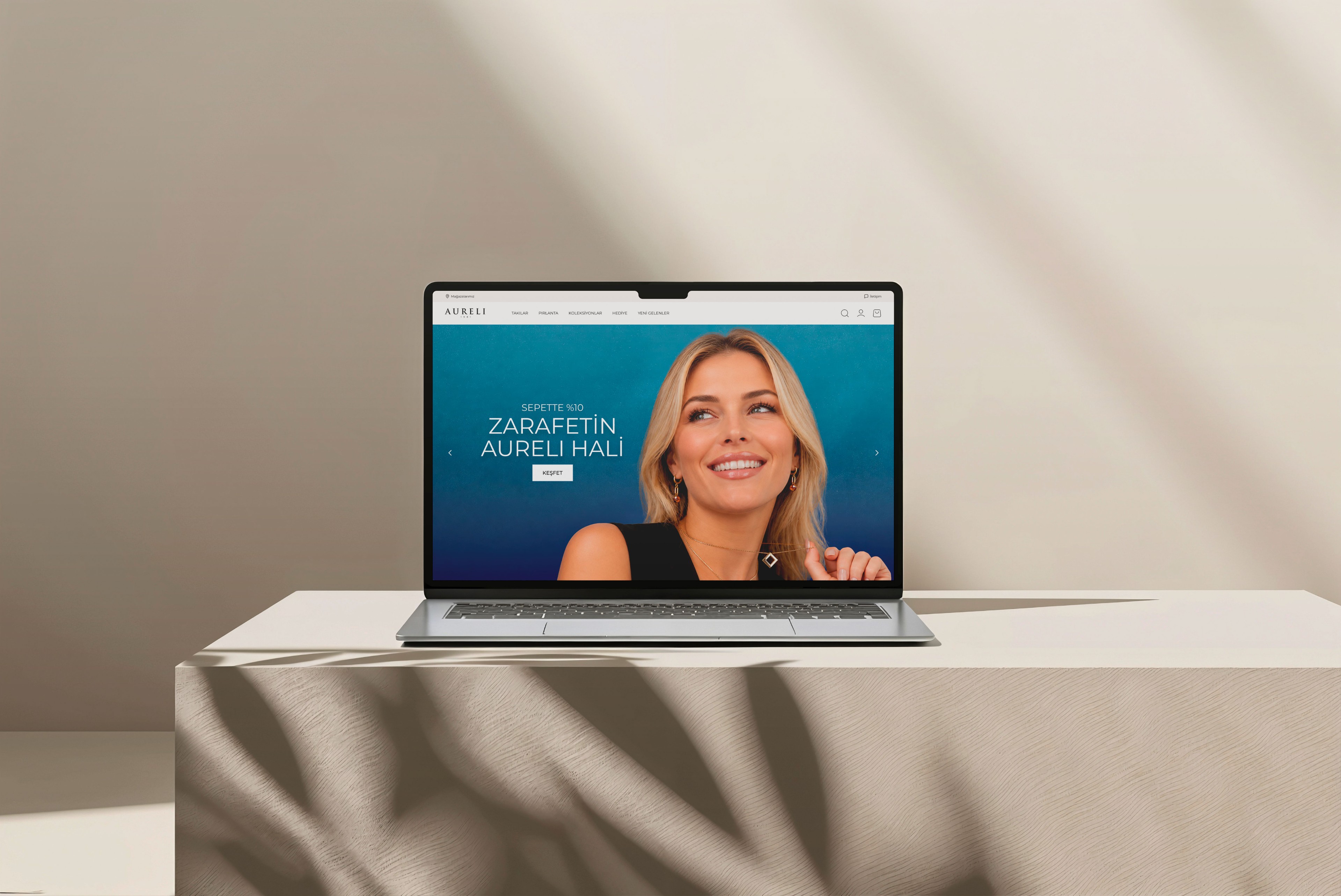
Clear categories, fast discovery
Rings, necklaces, bracelets and earrings are visually separated so people reach the right category fast. A simple category structure and strong imagery make browsing the collections clearer, tidier and more premium.
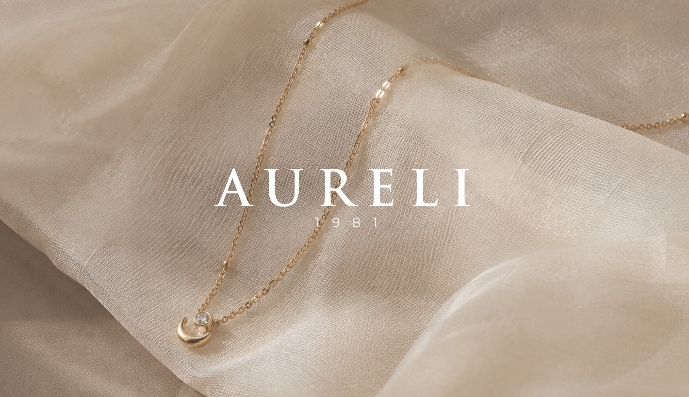
Luxury Jewelry Brand
AURELI is a luxury jewellery brand built on quality, trust and fine craftsmanship since 1981. It presents rings, necklaces, earrings and bracelets with a timeless aesthetic and a refined brand voice. The aim was to carry the brand’s heritage and premium character into a modern digital experience where collections can be explored in a simple, elegant and trustworthy way.
To bring AURELI’s timeless elegance, heritage and sense of quality online with a simple, prestigious and trustworthy shopping experience for modern customers.
I rethought AURELI’s web experience from the ground up, shaping the UI/UX, page structure and visual direction. I simplified the content hierarchy and product presentation so the collections stand out, and built a consistent interface system with typography, spacing and colour that supports the premium identity. I also focused on a responsive e-commerce flow that works comfortably on every device.
AURELI needed a digital presence that reflects its long heritage, premium craftsmanship and refined collections, while giving modern shoppers a clear and elegant experience.
I designed a clean, elegant web experience that reflects AURELI’s luxury identity and makes product discovery simple, refined and trustworthy.
June 1–7, 2026, 7 days.
Studying luxury jewellery sites
Home page flow and categories
Type, spacing and product cards
Packaging, box and signage trials

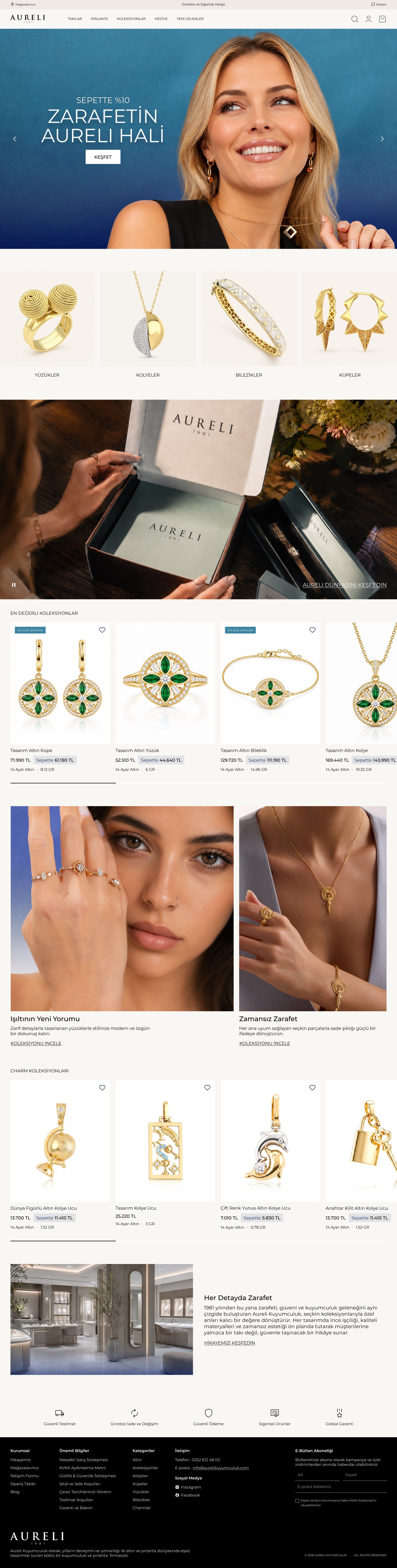
The whole home page, from categories and featured collections to the brand story and store details. Product photos lead; text stays short and quiet.
The page scrolls as you do

Rings, necklaces, bracelets and earrings are visually separated so people reach the right category fast. A simple category structure and strong imagery make browsing the collections clearer, tidier and more premium.
Product cards put the image at the centre while price, discount, weight and name, the details that drive a purchase, follow a calm, readable hierarchy. People find what they need quickly and the premium feel stays intact.

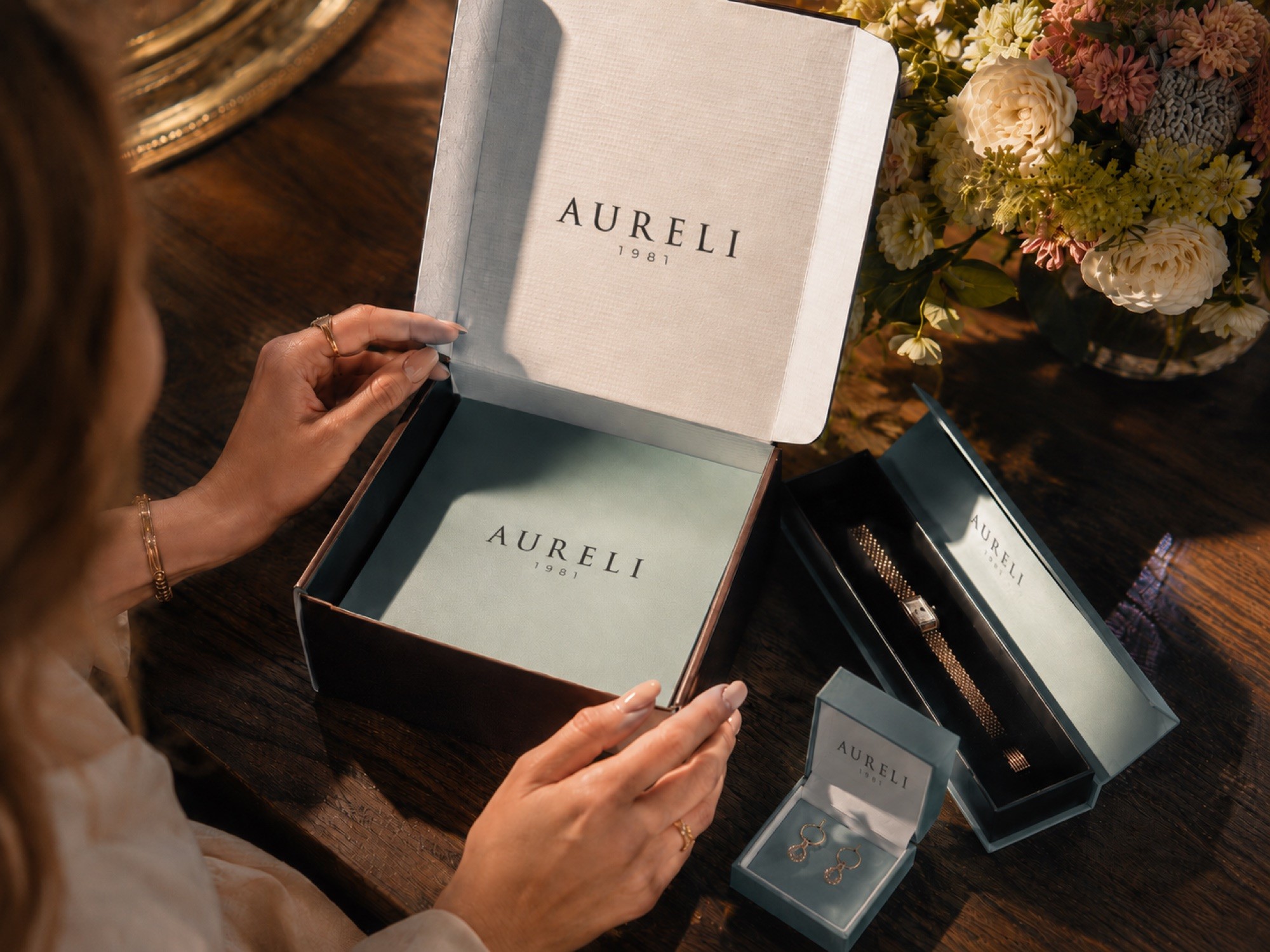
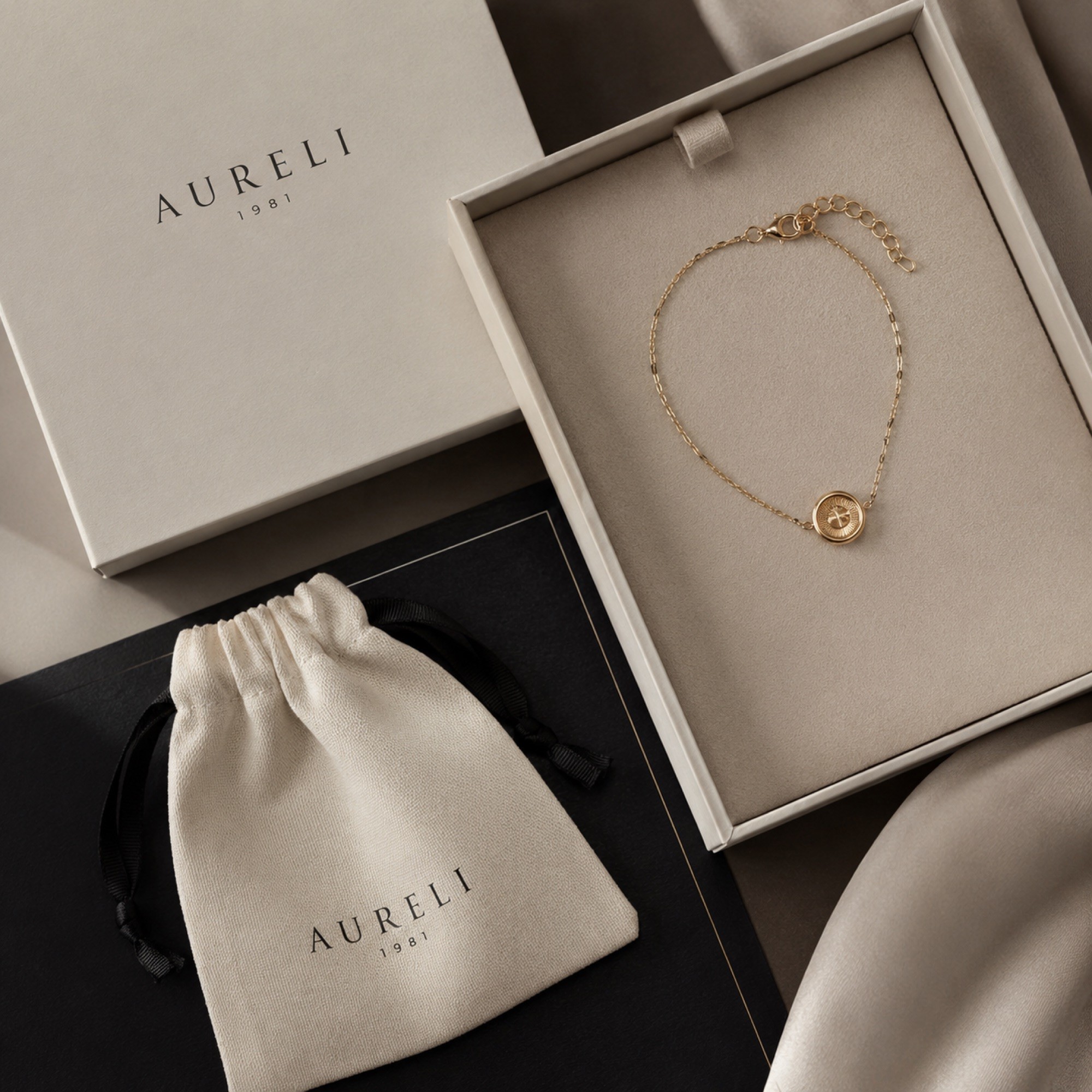
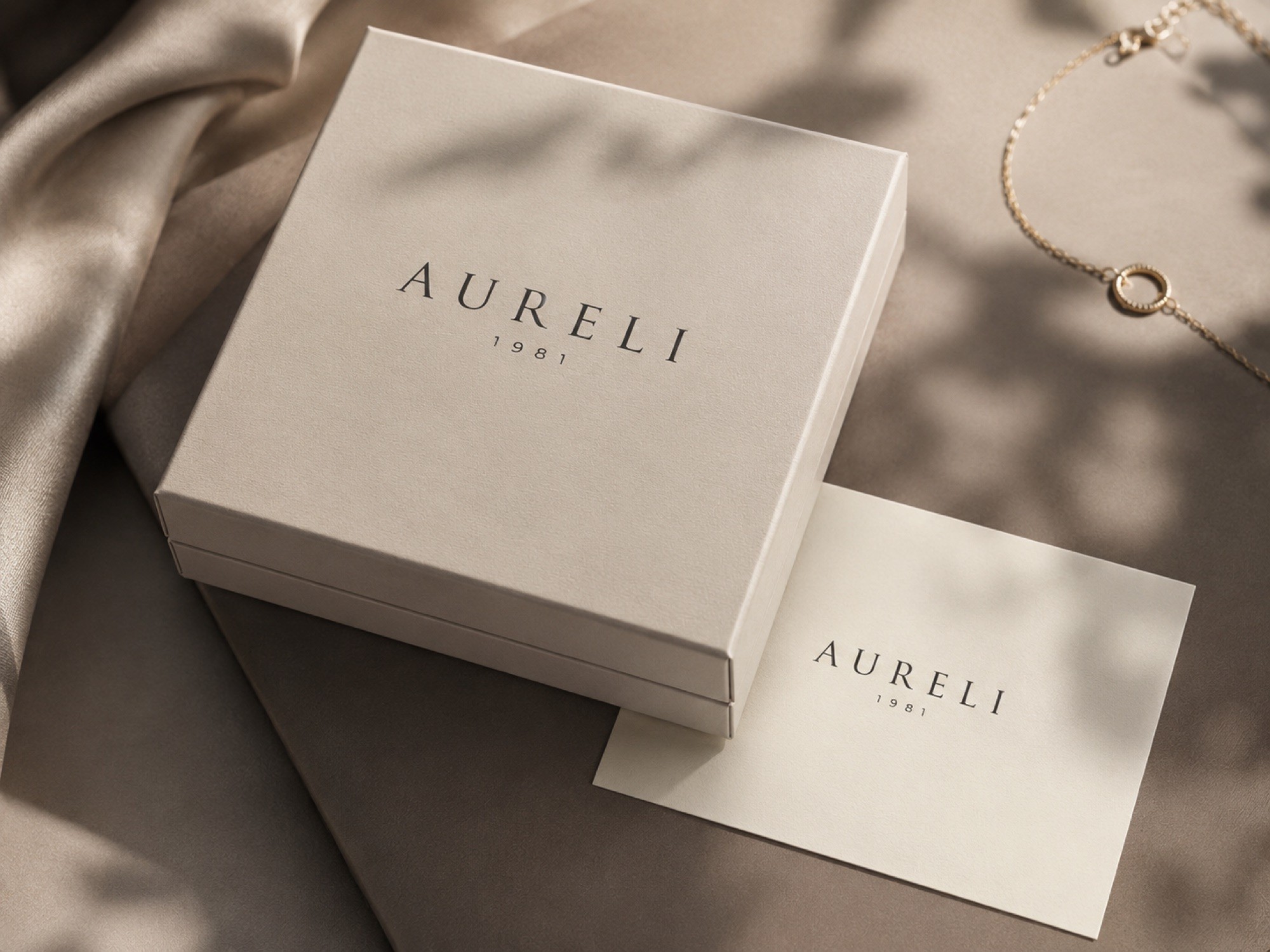
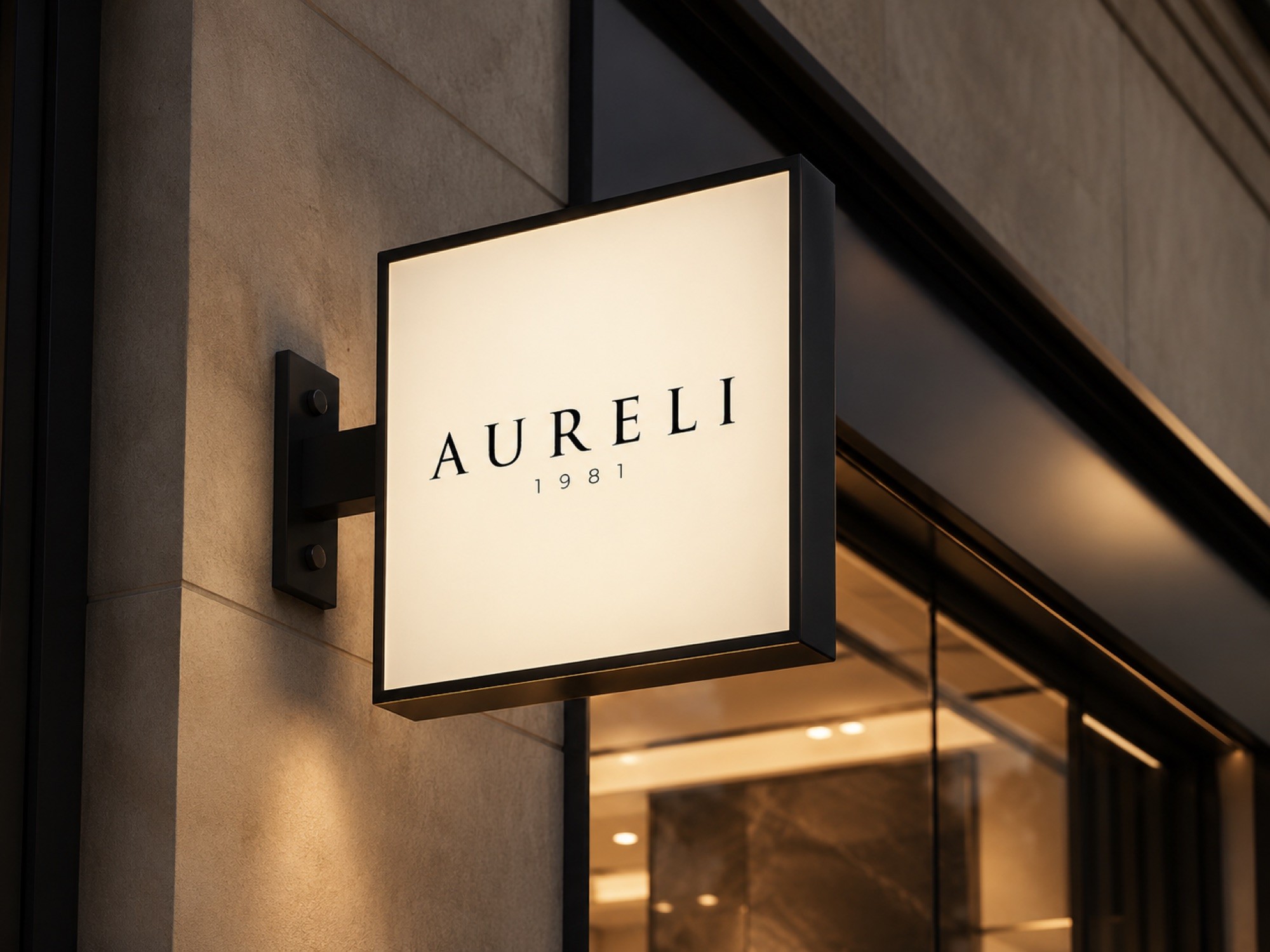
AURELI’s identity reflects its timeless elegance, heritage and premium character. A fine, balanced serif gives the brand a sophisticated, trustworthy presence, and the 1981 detail in the logo underlines decades of trust. Black, off-white and warm neutrals complete the luxurious feel without ever upstaging the jewellery.
Montserrat
A clean, wide sans-serif used across the site’s text. It balances the classic serif lettering of the logo.


See every screen and detail of the project in the Behance presentation.
View on Behance